Trend Watch: The Boxy White Cover
When we finally got back to our respective offices—and after we eulogized our plants—we found a giant stack of magazines to sort through. And we recognized a trend we saw rising in the “before times”: Boxy, white covers.
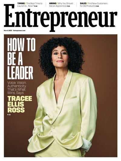
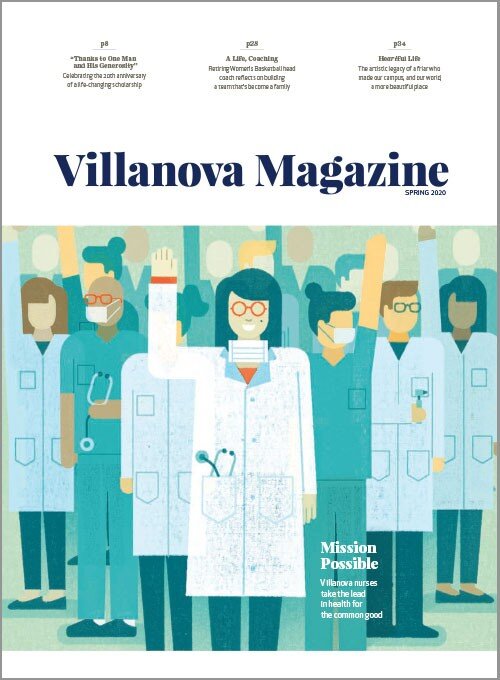
It was the recently redesigned Fortune that first made us think, “Man, where I have seen that approach before?'“ Everywhere, it turns out. See these recent examples from Entrepreneur, Villanova, Paper, and Upward.


We think we get it. This approach makes print feel weighty and substantial. It’s a clean aesthetic and it makes you want to put away your phone and read it in a naturally lit room sparsely furnished with mid-tier Ikea selections.
But we wanted to crowdsource a fuller answer here. So we asked a few trusted design minds to weigh in on why we are seeing so much white space on covers. First up, Kaajal Asher, an excellent design mind who has helped design everything from Harvard Business Review to Clark Magazine. Here’s Kaajal’s take:
With newsstand publications becoming more competitive—given that we are now using more of the digital versions of magazines—the box treatment of covers visually highlights the masthead/logo along with the secondary headlines more clearly and may help these magazines stand out more on the news stands amongst their competitors.
I feel this look works well when you have limited options for the cover image. From my personal experience, it eliminates the issue when photos for the cover are supplied to you that can be hard to work with but you have to make them work so the logo still reads when placed on it. This design format then lets you focus on making the headline work well on the image (which also has more mobility on the page along with flexibility on sizing which the masthead does not) giving it an overall cleaner look.
Definitely a cleaner look. And there’s something about it that feels book-ish and weighty—accentuating print as a break from the digital.
We also asked Erin Mayes of EmDash, who designs with Mo at Denison and for Dan at Harvard Business School (and many other fine institutions).
I’m not sure why exactly why this trend is popping up now. But I can tell you a few reasons why it looks new and fresh.
Mostly because it’s OLD! These design styles go in cycles.
Fortune in 1954 and 1957:
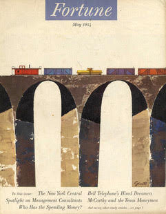
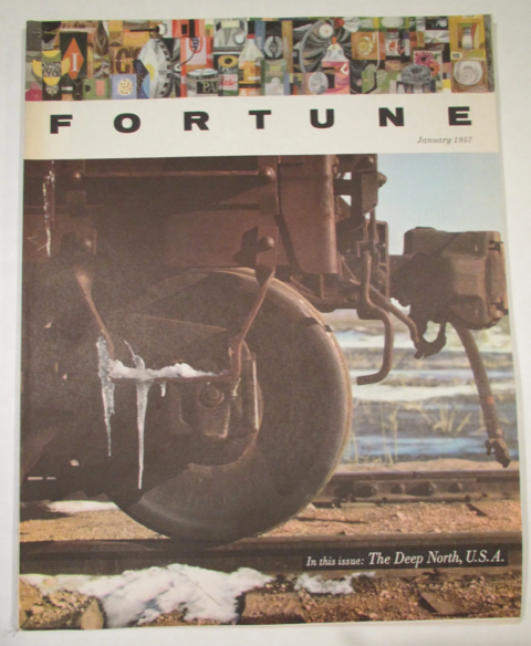
During any redesign you’re going to start by looking back at the history—and Fortune has a long long history of great covers (Except the 80s. Ha!)
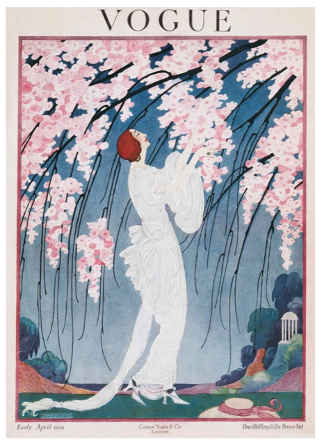
White boxes were all the rage in the 20s and turn of the century:
A lot of that probably had to do with how well printers could trim the edges or something like that—who knows.
But my money is that it was a production thing.
So now it’s happening again and it looks fresh. I could also send you examples of this popping up in the 70s. I feel like the style in the 80s+ was all about “impact" and being in-your-face—not about restraint and craft (which seems to be the swing now). Also: That was the heyday of magazine publishing—too many covers to compete with on the newsstand made everything super loud.
ANYWAY. Cycles.
The other big reason that I think magazines like the white boxes is that it cleans up the cover in a big way. Everything has its space. And you can noodle a little with bumping something into the space of another thing. But all the information is clear—there’s a clear hierarchy. It’s visually easy to digest and easy to read. And I think folks in this moment right now, like clarity and simplicity over things shouting at them (visually).
Everything old is new again, y’all. Thanks to Kaajal and Erin for lending the lessons.
—
Need some design support? Our design team can help. Drop us a line.