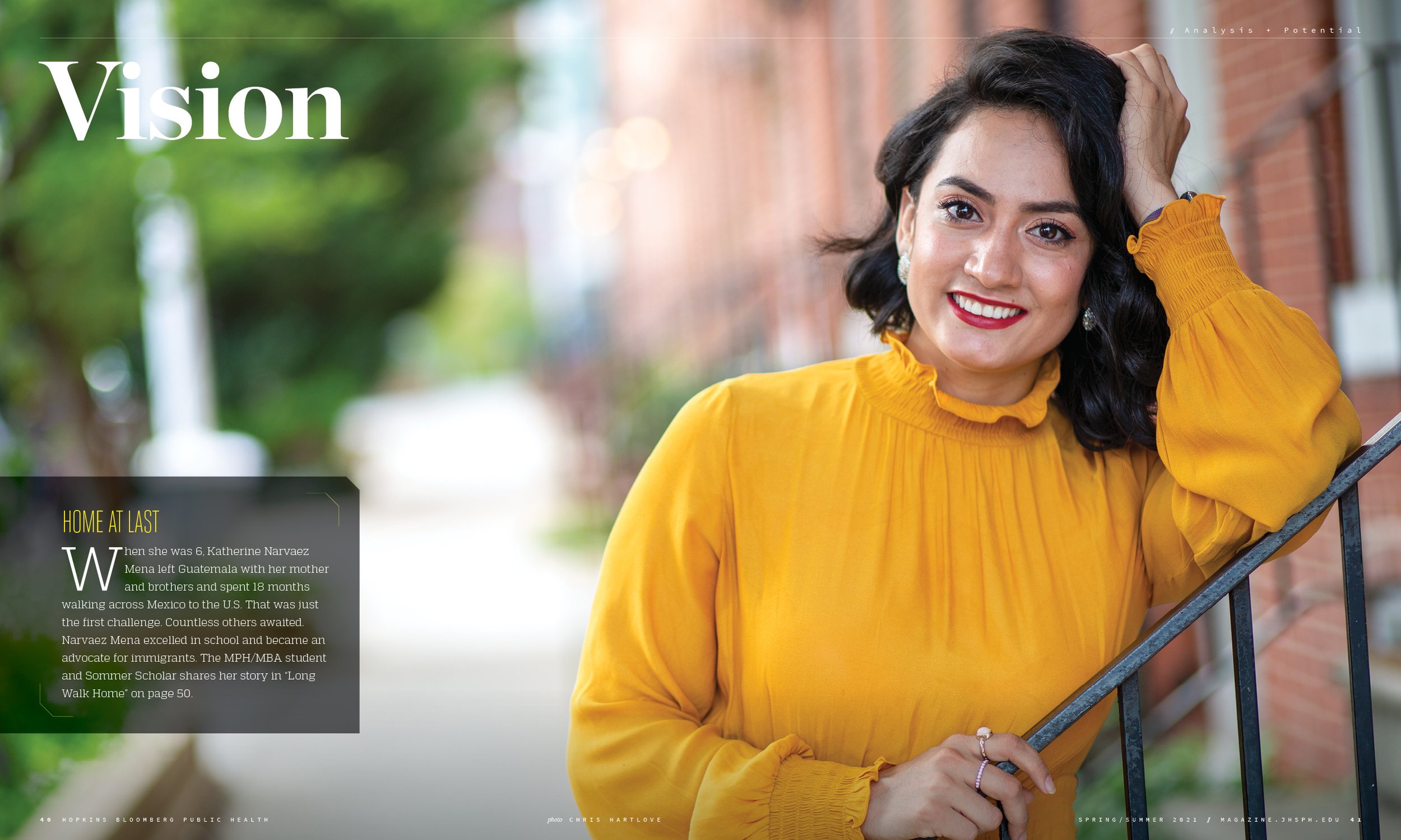
An inside look at how we reimagined Hopkins Bloomberg Public Health magazine

About a year before the pandemic first reared its head, the editors of Hopkins Bloomberg Public Health—the flagship publication of the Johns Hopkins Bloomberg School of Public Health—approached us with the proposition: Redesign the magazine we had originally redesigned 6 years prior and continued to design ever since.
It was prime time to do it. Audience habits had changed. Design trends had evolved. And as the world faced new public health challenges, the role of external communications in the public health field had taken on new meaning. But objectively assessing your own body of work comes with its challenges. Reinventing and improving on that body comes with even more. These challenges inspired us. So we got to work.
We started with a new mission statement, moved on to revamped content structures, then on to all the design nuances. Then came SARS-CoV-2.
America and much of the world turned to the Johns Hopkins Bloomberg School of Public Health for daily updates on Covid 19. Our work took on new meaning. We saw firsthand that communication coming out of the public health field was just as important as the work being done within it. We saw it as our mission to help the magazine and the school stop people in their tracks, inform them about this pandemic and future ones, and tell thought-provoking public health stories that promote a healthier and safer world at large.
Scroll through this gallery for an overview of the magazine’s new look.
In the throes of the pandemic’s worst, we helped build a special pre-redesign Covid-19 themed issue that won a CASE gold award and teased at some of the magazine’s new design features.
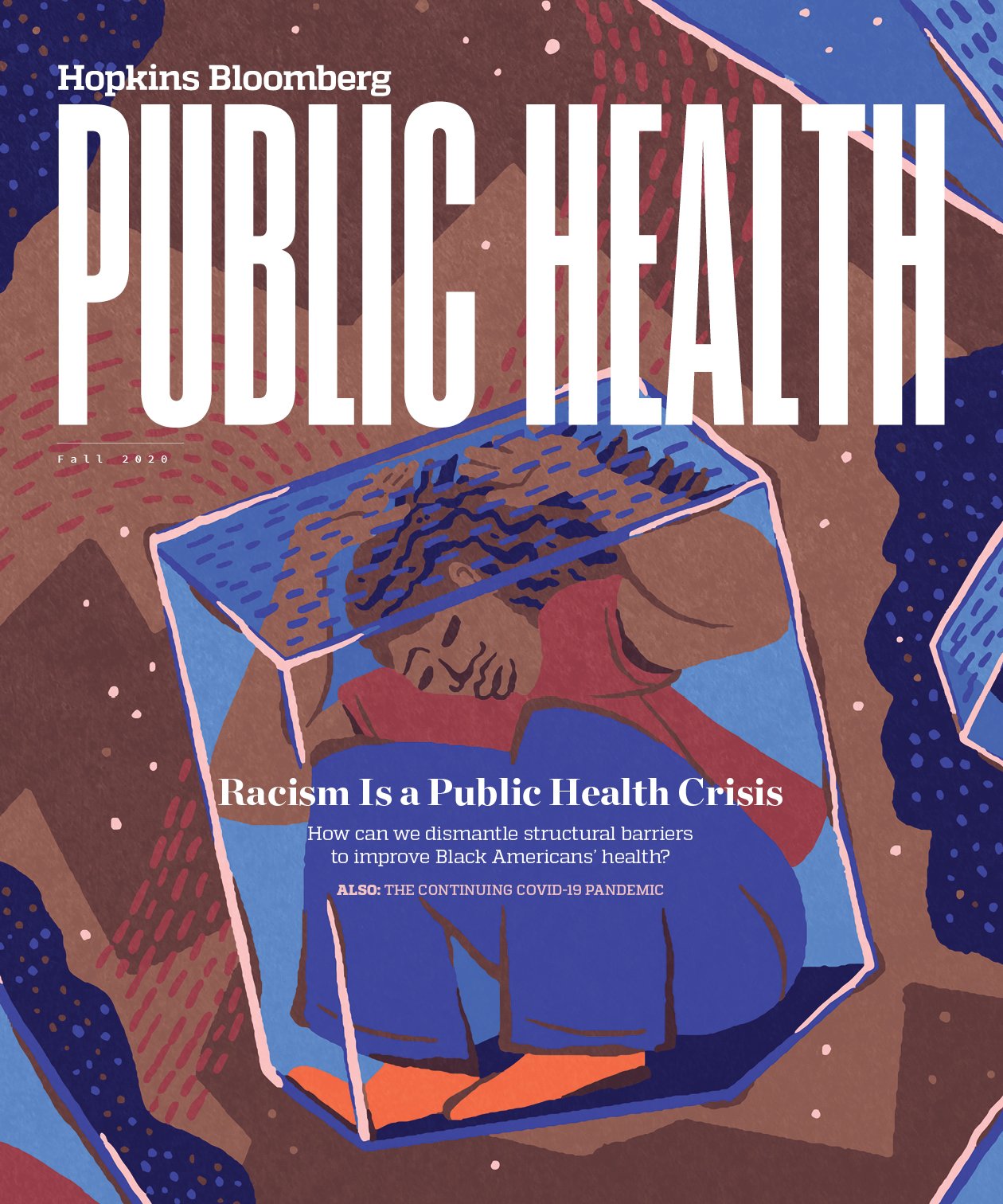
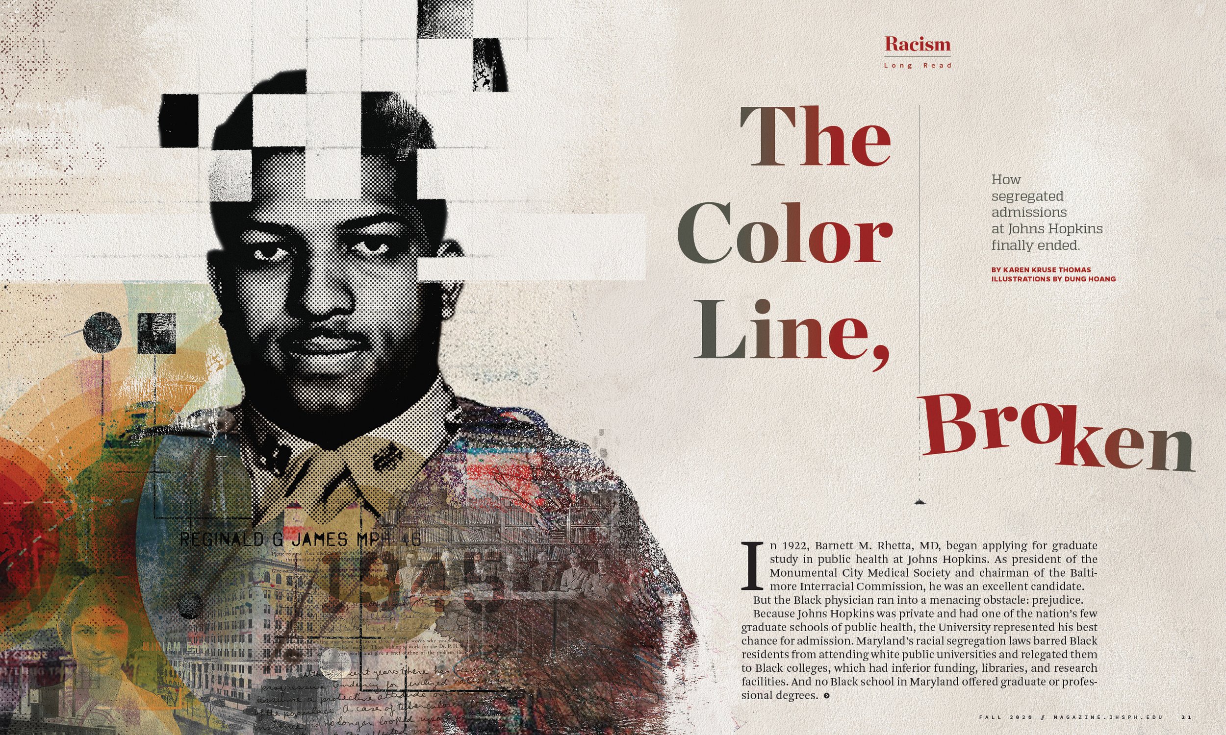
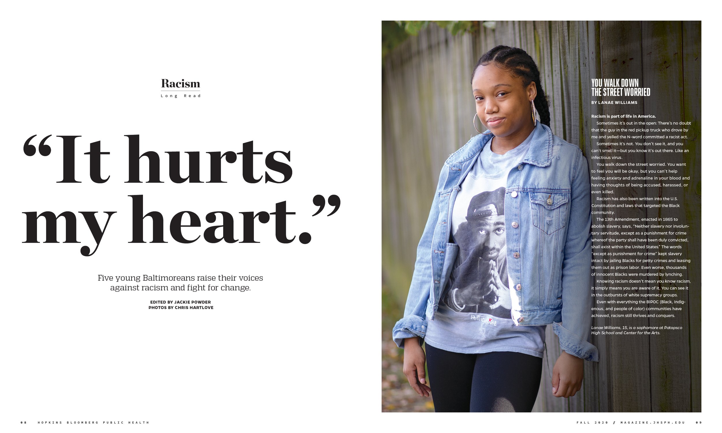
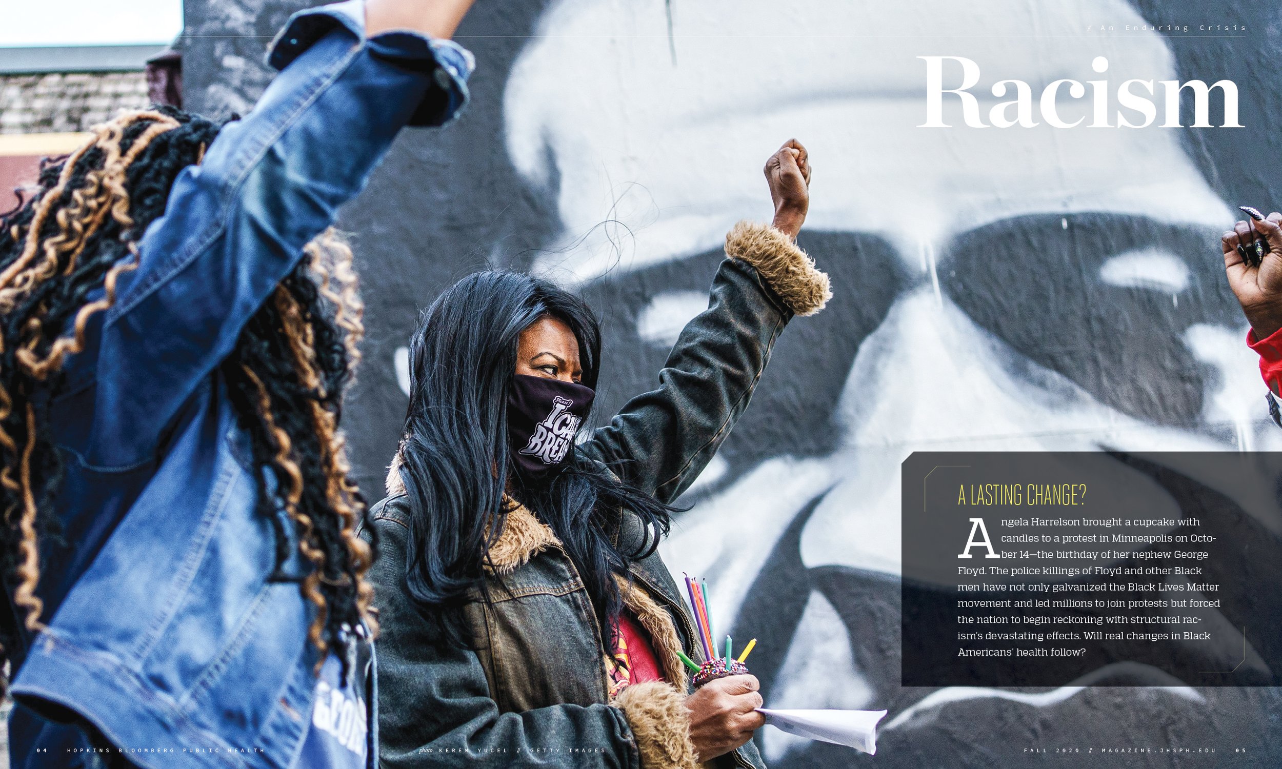
Following that, we launched the redesign in fall 2020 with an issue focused on racism as a public health problem, and have continued designing with renewed momentum ever since.
Here’s a look under the hood at the magazine’s new design structure and storytelling.
New, three-section format
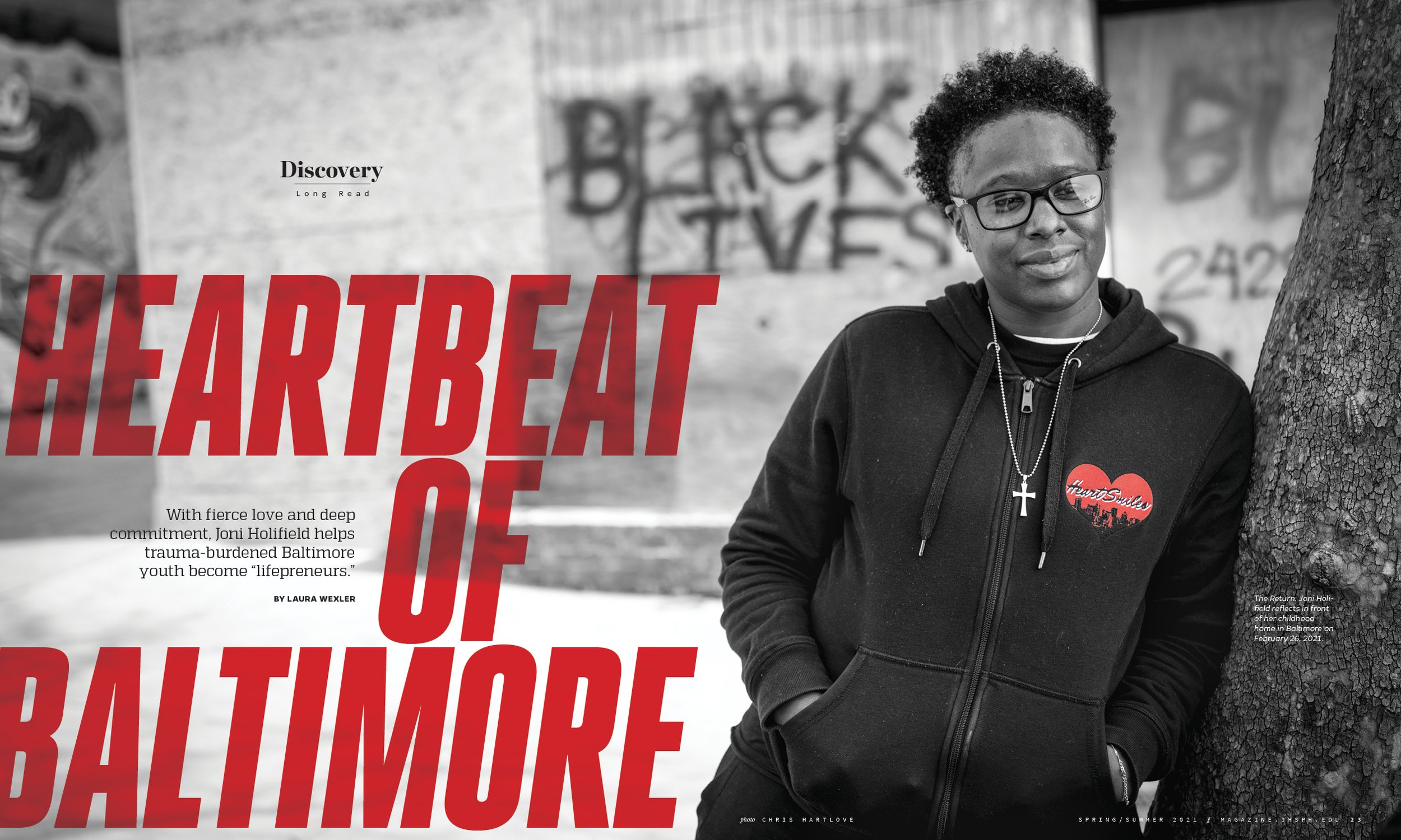
A themed opening section rotates its focus to address the most poignant and topical public health issues of the day; two additional sections — Discovery and Vision — address emerging research and breakthroughs, and fresh ideas by public health practitioners and the people they serve.

Larger format
An increased page size adds heft to the physical format and added layout flexibility.

Redesigned nameplate
A greater emphasis on "public health" offers a design nod to the school owning the public health conversation.
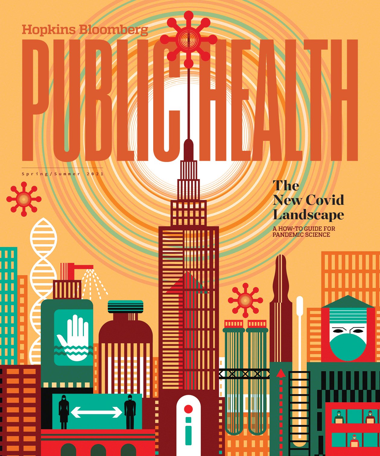
Wrap-around cover design
The new cover approach uses the full width of the format for high-impact visuals that physically “wrap” each issue’s content together


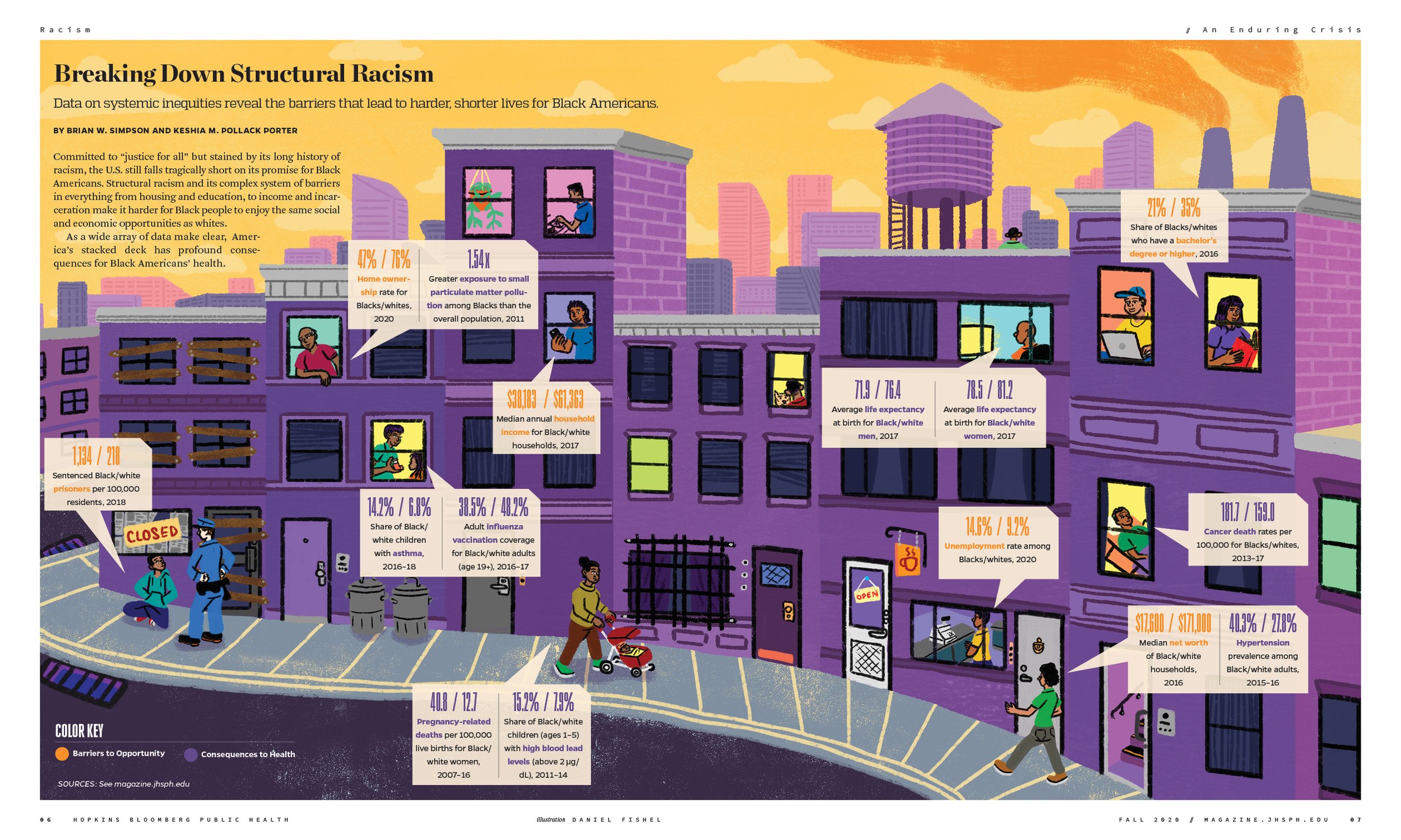
6-column grid for more design versatility
The new grid provides greater flexibility with story formats and added visual entry points of entry each spread.

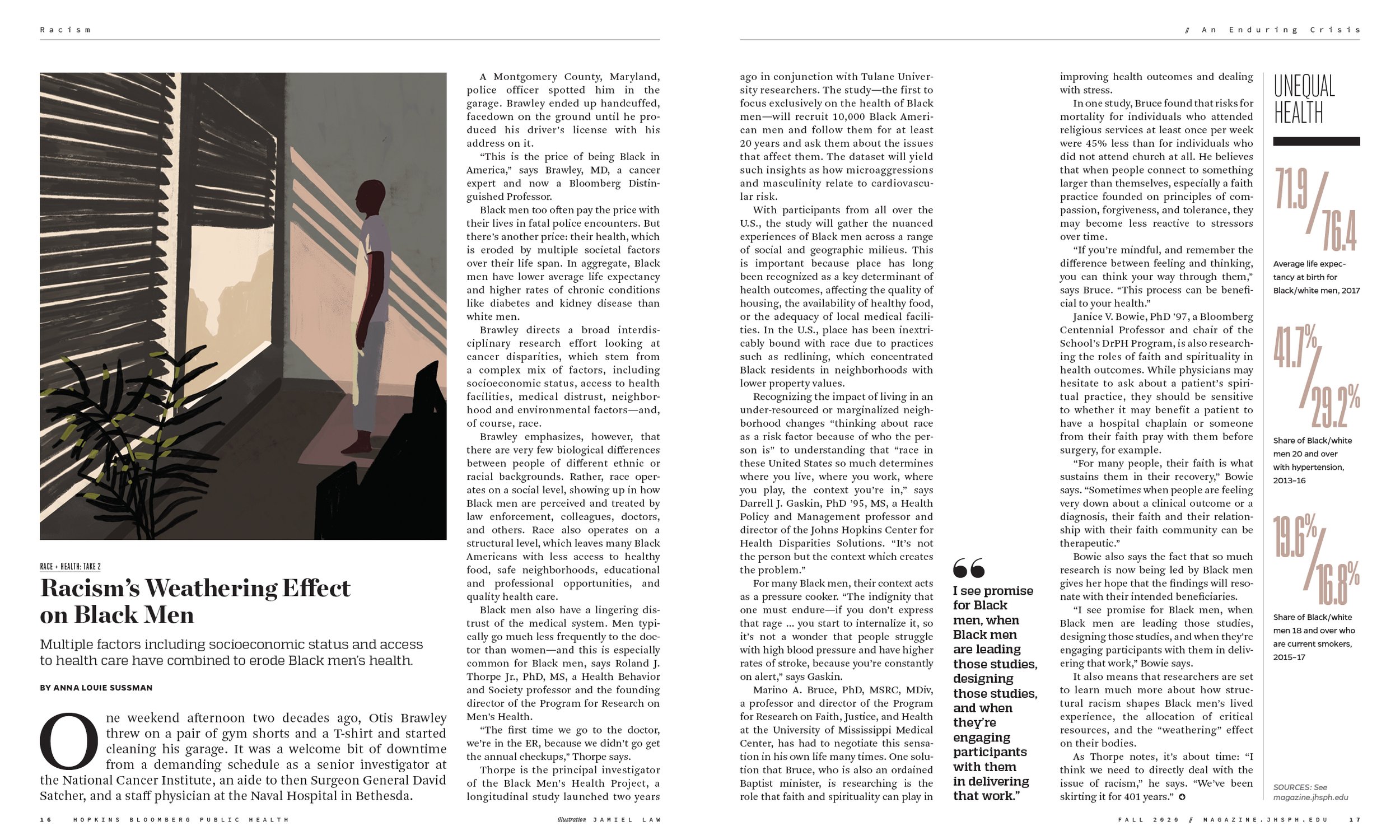
Selective white space
Added white space enhances visual lightness while improving reading experience and overall information architecture.

Expanded typographic structure
Additional font families and headline and body text treatments improve the magazine’s organization and support new content vehicles, all while delivering a livelier look.
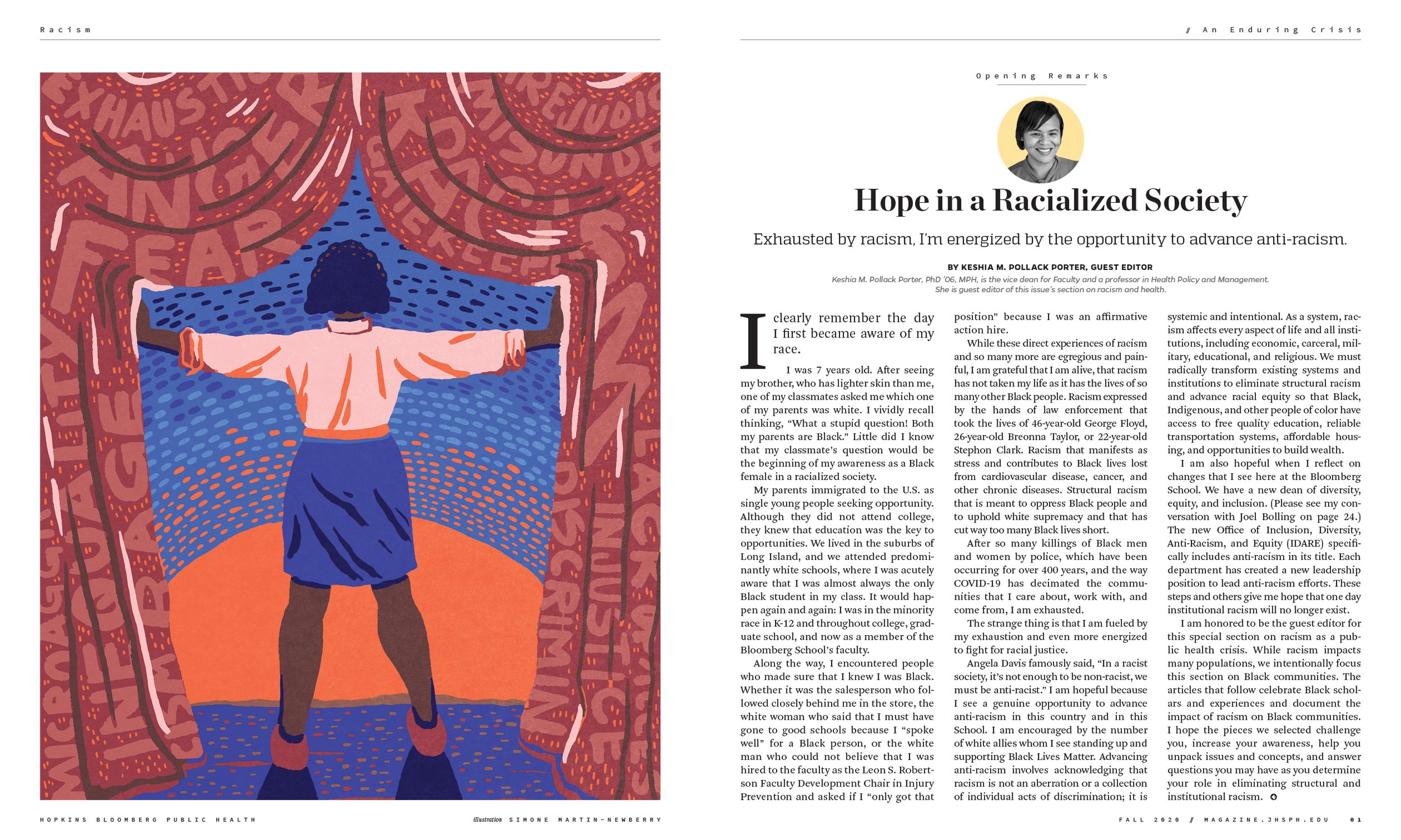
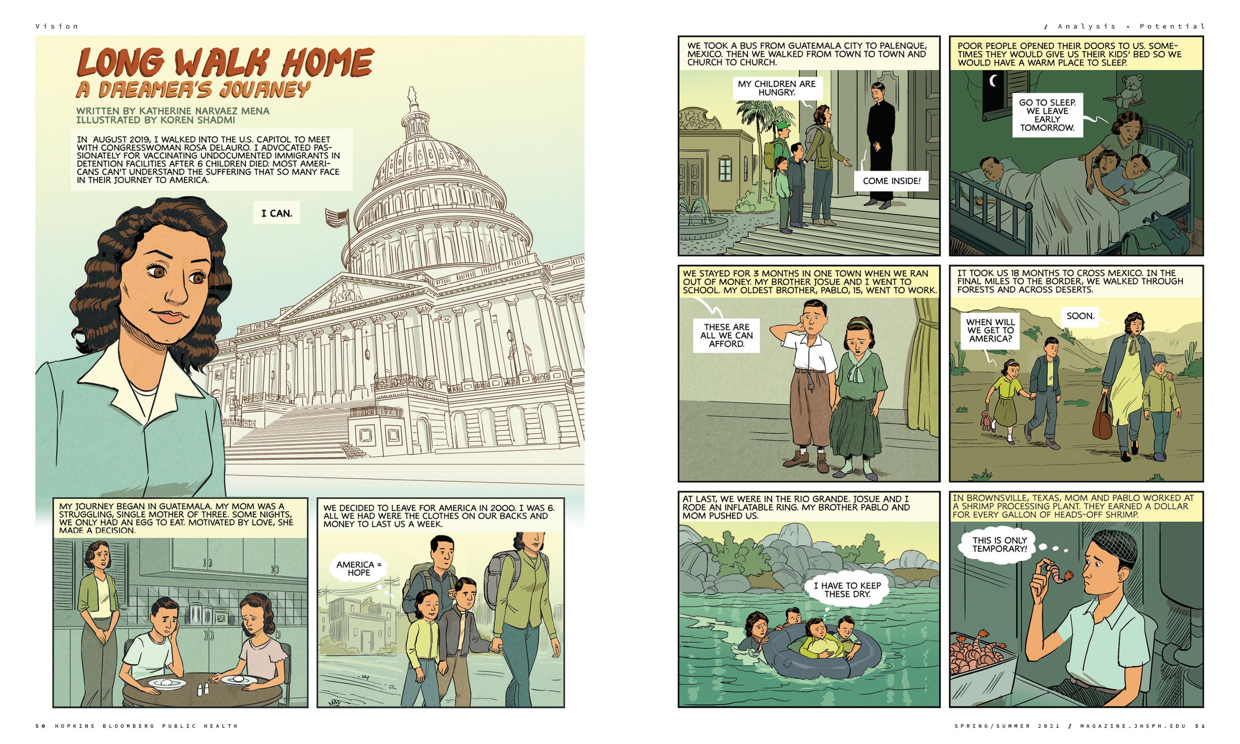
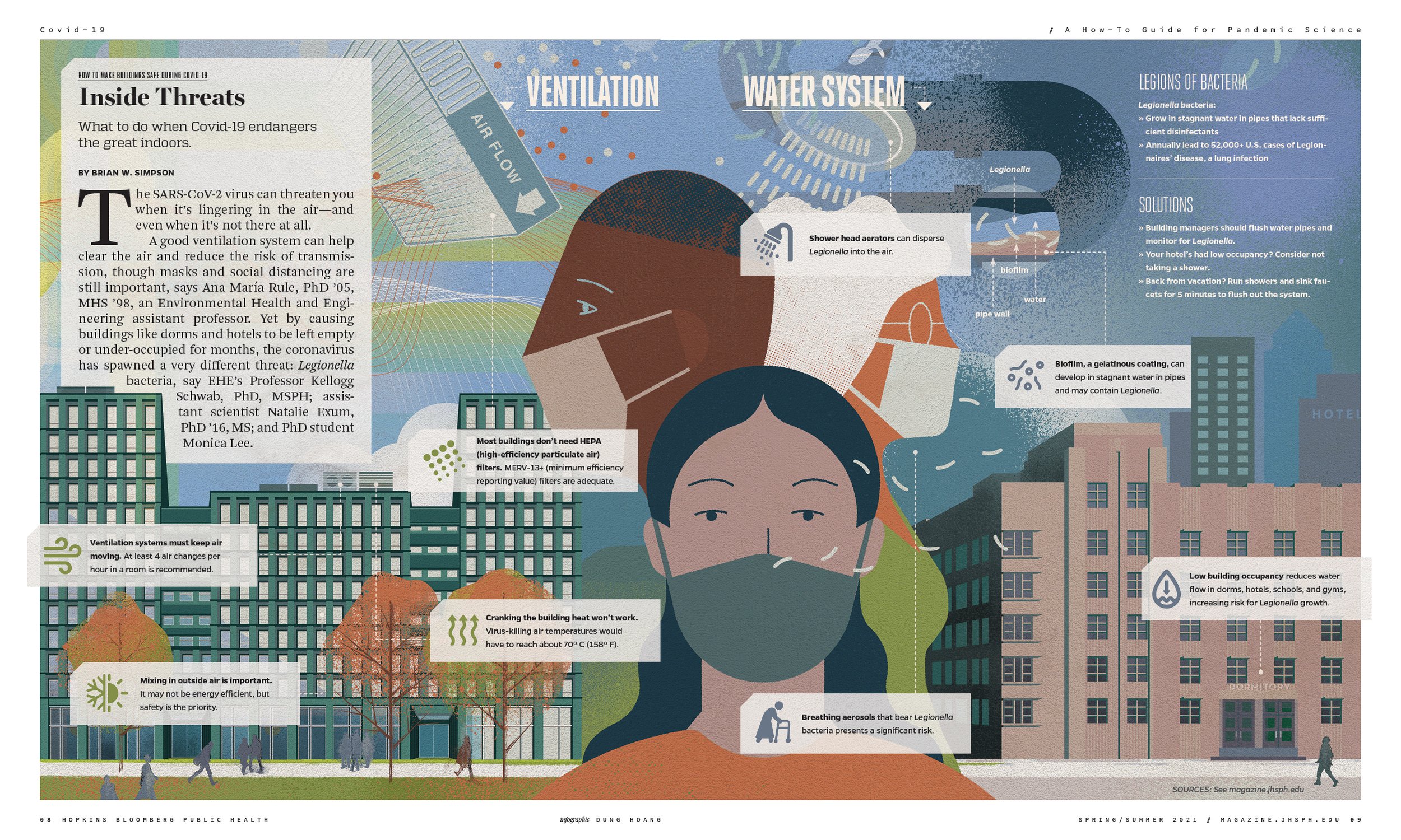
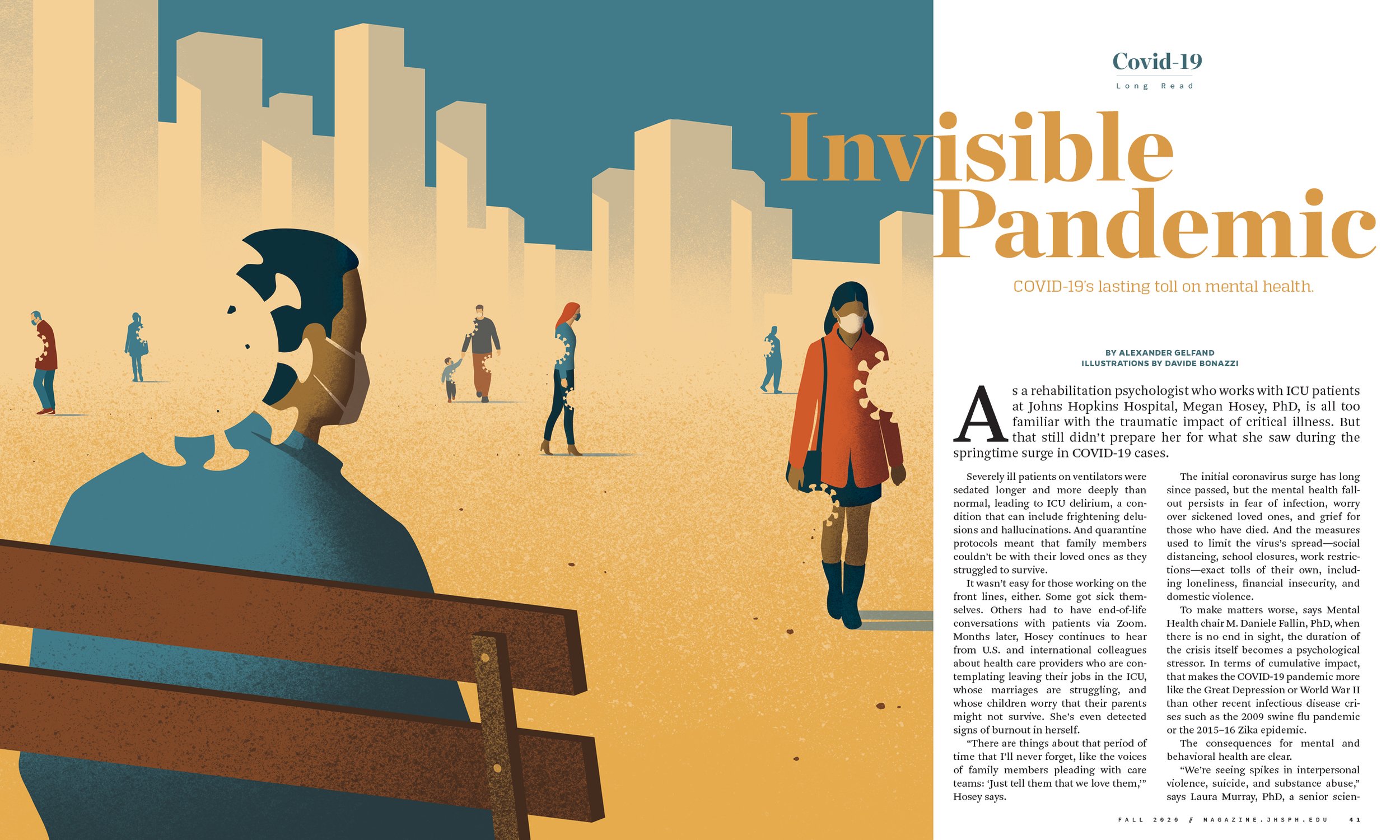
Expanded roster of illustrators
Bold, modern visuals distill complex public health topics with an appropriate mix of intellectualism and artistry.

—
Ready to rethink, reinvent or redesign? Drop us a line.